Widgets
There are a number of widgets that can be used in a template. Some widgets are containers that contain other widgets, leading to a nested structure, other widgets allow for simple inputs, and yet other widgets allow complex annotations such as markers or contours to be placed.
Available widgets
Widget name |
Type |
Description |
|---|---|---|
Container |
||
Container |
||
Listing container |
||
Simple input |
||
Simple input |
||
Simple input |
||
Simple input |
||
Simple input |
||
Simple input |
||
Display and input |
||
Display |
||
Annotation |
||
Annotation display |
||
Annotation |
||
Annotation |
||
Display and calculation |
||
Data validation |
TabsWidget
A TabsWidget is for grouping the widgets on different tabs to save space and keep an overview of all widgets. For example:
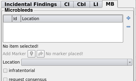
Example of a TabsWidget in the viewer. You can see the tabs bar at the top and the content of the tab bellow the tabs bar. The content of a tab can contain any other widget, include another TabsWidget.
Template
In the template a TabsWidget is specified using the additional parameters:
Parameter |
Type |
Required |
Description |
|---|---|---|---|
content |
object |
yes |
Object with key is tab name and value is another object with children qa_fields. |
order |
list |
no |
Order in which to show the tabs, defaults to a random order. |
An example of a tabs widget in a template would be:
{
  "tabs": {
    "control": "TabsWidget",
    "label": "tabs",
    "y": 0,
    "x": 0,
    "order": [
      "Tab 1", "Tab 2"
    ],
    "content": {
      "Tab 1": <qa_fields>,
      "Tab 2": <qa_fields>,
    }
  }
}
The qa fields are an object where the key is the widget name and the value describes another widget.
Resulting data
The resulting data will be a dict where the key is the key in the content
parameter and the value will be the value of the corresponding nested widget. The
tabs are not featured in the data structure, as it is purely a visual grouping.
Given the sample about, if Tab 1 would contain field1 and field2 and
Tab 2 would contain field3 then the resulting data structure would be:
{
  "tabs": {
    "field1": <value>,
    "field2": <value>,
    "field3": <value>,
  }
}
BoxWidget
A box widget is for grouping a number of widgets visually. Unlike the TabsWidget, all items in a box widgets are visible at the same time. Only are they grouped together in a box, see:
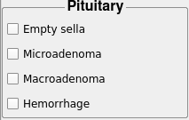
Example of a BoxWidget in the viewer. You can see the box has a label and the child widgets are grouped together.
Note
The resulting data structure is also grouped together.
Template
In the template a BoxWidget is specified using the additional parameters:
Parameter |
Type |
Required |
Description |
|---|---|---|---|
content |
object |
yes |
Object with child qa_fields. |
align_title |
string |
no |
How to align the title of the box can be: Left (default), Right or Center |
Which translates to a entry in the template:
"box_widget": {
  "control": "BoxWidget",
  "label": "Box Label",
  "y": 0,
  "x": 0,
  "content": <qa_fields>,
  "align_title": "Center"
}
Resulting data
The resulting data will be a dict where the key is the key in the content
parameter and the value will be the value of the corresponding nested widget.
Given the example, the data structure would simple follow:
{
  "box_widget": {
    "field1": <value>,
    "field2": <value>,
    ...
  }
}
Where field1 and field2 would be fields represented in the <qa_fields>
ListingWidget
The ListingWidget is a special widget that allows a list of certain elements to be defined. It contains a number of nested widgets, which have to be filled for each entry in the list. The listing widget presents a list where the user can add, remove or switch between different list items.
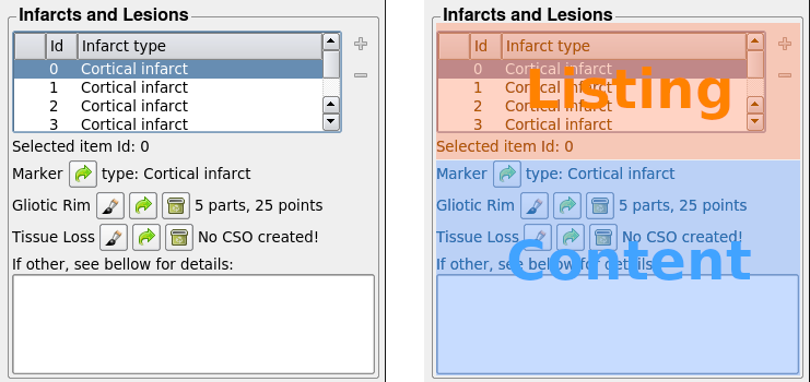
Example of a ListingWidget in the viewer. On the right you see different parts of the widget annotated. The top part (orange) contains the listing widgets own GUI elements, whereas at the bottom area (blue) the nested widgets are is situated.
Template
In the template a BoxWidget is specified using the additional parameters:
Parameter |
Type |
Required |
Description |
|---|---|---|---|
content |
object |
yes |
Object with child qa_fields. |
columns |
array |
yes |
The columns to display in the listing. This should be an array of strings indicating names of nested widgets. |
Which translates to a entry in the template similar to:
{
  "control": "ListingWidget",
  "label": "listing",
  "y": 0,
  "x": 0,
  "content": {
    "nested_widget1": <object>,
    "nested_widget2": <object>,
    "nested_widget3": <object>
  },
  "columns": [
    "nested_widget1",
    "nested_widget2"
  ]
}
The resulting ListingWidget will have a listing with 3 columns: id, the label of nested_widget1, and the label of nested_widget3. The values will be automatically synced with the appropriate values for content of the listing.
Resulting data
This widget produces a array of objects are the result data, for the
example above:
{
  "listing": [
    {
      "nested_widget1": ... ,
      "nested_widget2": ... ,
      "nested_widget3": ...
    },
    {
      "nested_widget1": ... ,
      "nested_widget2": ... ,
      "nested_widget3": ...
    },
    ...
  ]
}
The length of the list corresponds with the number of entries in the listing.
For each item a object matching the content will be present.
CheckBox
Simple CheckBox widget that will result in either a True or False in the fields file. There’s an extra option to add alerts to the checkbox. This can either be active when unchecked or when unckecked. The checkbox + label will be rendered Red to signal importance. Also when the checkbox is placed in a tab a * will be rendered in the tab signalling the user that action is needed.

Example of a CheckBox widget
In the example above, signalling will be in place as long as the checkbox is unchecked.
Template
In the template a BoxWidget is specified using the additional parameters:
Parameter |
Type |
Required |
Description |
|---|---|---|---|
alert_on_checked |
boolean |
False |
Create an alert when this checkbox is checked |
alert_on_unchecked |
boolean |
False |
Create an alert when this checkbox is unchecked |
For example:
{
  "Alerting_Checkbox": {
    "control": "CheckBox",
    "label": "Alerting Inspected",
    "alert_on_unchecked": True,
    "x": 0,
    "y": 1,
    "type": "Bool"
  }
}
NumberEdit
Simple widget to enter a number.
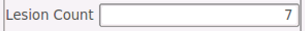
Example of a NumberEdit widget
Example:
{
  "FlairLesionRating": {
    "control": "NumberEdit",
    "initial_value": "",
    "documentation": "",
    "label": "Lesion Count",
    "x": 0,
    "y": 2,
    "type": "Float"
  }
}
ComboBox
The Combobox widget can be used to give the user a fixed set of options to choose from. These can be selected from a dropdown menu.

The combobox has is a drop down, you can choose a different option by clicking the box.
Template
There is only one additional parameter for a ComboBox:
Parameter |
Type |
Required |
Description |
|---|---|---|---|
options |
array |
yes |
A list of the options a user can select |
In the example below there’s a fixed set of options (usable, questionable, unusable):
{
  "Quality_ComboBox": {
    "control": "ComboBox",
    "label": "FLAIR usable",
    "x": 0,
    "y": 1,
    "type": "Enum",
    "options": [
      "usable",
      "questionable",
      "unusable"
    ]
  }
}
Resulting data
The resulting data is just the value of the selected option, for example:
{
  "Quality_ComboBox": "usable"
}
Note
The datatype of the value will the same as the option, so an option “1” would be a string, whereas option 1 would be an integer. This would be noticeable in the result file.
RadioButtonGroup
The Combobox widget can be used to give the user a fixed set of options to choose from. These can be selected by using any of the radion button.
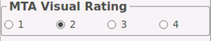
Example of a RadioButtonGroup widget
Template
There is one additional parameter for this widget:
Parameter |
Type |
Required |
Description |
|---|---|---|---|
orientation |
string |
yes |
The orientation of the buttons: horizontal (default) or vertical |
In the example below the user can enter a score ranging between 1-4. There’s an extra option that can be used to choose the orientation (horizontal, vertical) of the radiobuttons:
{
  "RatingRadioButtonGroup":{
    "control": "RadioButtonGroup",
    "label": "MTA Visual Rating",
    "x": 0,
    "y": 1,
    "orientation": "horizontal",
    "type": "Enum",
    "options": [
      "1",
      "2",
      "3",
      "4"
    ]
  }
}
Resulting data
The resulting data is just the value of the selected option, for example:
{
  "RatingRadioButtonGroup": "2"
}
LineEdit
Widget giving allowing the input of a single line of text.

Example of a LineEdit widget for a single line of text
Template
There is one extra parameter for the line edit: a hint text that appears on a mouse over.
Parameter |
Type |
Required |
Description |
|---|---|---|---|
hint_text |
hint_text |
no |
Hint to show on a mouse over of the GUI element. |
For example:
"comments": {
  "control": "LineEdit",
  "type": "String",
  "label": "Comments: ",
  "hint_text": "Comments about things not captured in other fields",
  "x": 0,
  "y": 10
},
Resulting data
The resulting data is just the value of the selected option, for example:
{
  "RatingRadioButtonGroup": "2"
}
TextBox
A text box widget for inputting larger amounts of text.
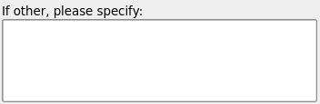
Example of a TextBox widget for larger amounts of text
Template
There is only an added editable parameter that has a bit better control than the default enabled parameter, as it only disallows editing the text, but not disable the widget (e.g. gray it out)
Parameter |
Type |
Required |
Description |
|---|---|---|---|
editable |
boolean |
no |
Controls whether or not the input box is enabled, defaults to true |
Example template specification:
"infarct_other": {
  "control": "TextBox",
  "label": "If other, please specify:",
  "x": 0,
  "y": 2
}
Resulting data
The resulting data is just the value of the selected option, for example:
{
  "infarct_other": "Description of a really weird infarct"
}
ConversationWidget
The ConversionWidgets allows the creation of a conversation. Every time a task is saved with text in the input box a new entry is added the conversation. The username and timestamp are added, creating a chat-like experience.
Template
There is only an added editable parameter that has a bit better control than the default enabled parameter, as it only disabled the input box and not the entire widget.
Parameter |
Type |
Required |
Description |
|---|---|---|---|
editable |
boolean |
no |
Controls whether or not the input box is enabled, defaults to true |
For example:
"comments": {
  "control": "ConversationWidget",
  "label": "Comments: ",
  "x": 0,
  "y": 8
}
Resulting data
The resulting data of the conversation widget is a bit more complex than a normal textbox. It contains the list of all entries in the following form:
{
  "comments": [
    {
      "user": "string",
      "timestamp": "2000-01-01T00:00:00.000000",
      "value": "message entry"
    },
    ...
  ]
}
So each time the task is save, a timestamped entry is added to the value.
JSONDisplay
The JSON display is a widget that can display information from a JSON file downloaded from a given URL. You have some control over which fields in the JSON are displayed. The widget is purely for display and data cannot be edited.
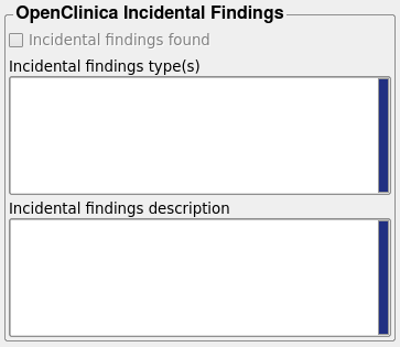
Example of a JSONDisplay to display contents of an external JSON file (located on XNAT)
Template
In the template you need to specify the fields to display and what gui element to use for that.
Parameter |
Type |
Required |
Description |
|---|---|---|---|
content |
object |
yes |
The content to show, this defines the fields
to display. This is an object with the JSON key
as the key and small object containing a |
textrows |
int |
no |
The number of rows each textbox for displaying the text. |
An example of a JSON display which displays one boolean (checkbox) and two pieces of txt (textbox):
"oc_if_display": {
  "control": "JSONDisplay",
  "label": "OpenClinica Incidental Findings",
  "x": 0,
  "y": 12,
  "textrows": 6,
  "content": {
    "incidental_finding_found": {
      "label": "Incidental findings found",
      "type": "boolean"
    },
    "incidental_finding_named_types": {
      "label": "Incidental findings type(s)",
      "type": "text"
    },
    "indidental_finding_description": {
      "label": "Incidental findings description",
      "type": "text"
    }
  }
}
Resulting data
The data in and out is the URL of the JSON file to display:
{
    "oc_if_display": "http://www.example.com/some/file.json
}
MarkerEdit
The parker edit is for placing markers on a scan. Their position is saved in world coordinates.
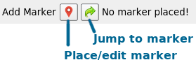
Example of a MarkerEdit widget placing a marker, the left button is to enter edit mode, the right button is to jumping to the marker. Edit mode allows placing/moving the marker.
Template
In the template the type and number of marker(s) has to be specified.
Parameter |
Type |
Required |
Description |
|---|---|---|---|
max_number |
int |
yes |
The number of markers allowed to be placed |
marker_type |
int/string |
no |
The type/class of marker. An integer is a fixed type. A string should reference a widget that controls the marker type |
groups |
array |
no |
Definition of the marker types and styles. This is an array of objects. |
For example, to have a marker that can have 2 classes and of which the class is
connected to a combobox infarct_type you would get:
"infarct_marker": {
"control": "MarkerEdit",
"label": "Add Marker",
"max_number": 1,
"marker_type": "infarct_type",
"groups": [
{
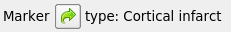
"label": "Cortical infarct",
"description": "The outline of the infarct",
"marker_size": 4,
"marker_type": "Square",
"line_width": 2,
"color": [255, 123, 4]
},
{
"label": "Subcortical infarct",
"description": "The outline of the infarct",
"marker_size": 4,
"marker_type": "Square",
"line_width": 2,
"color": [44, 115, 255]
}
],
"x": 0,
"y": 0
}
As you can see the groups are a list of object describing the markers visual style and name. The fields that can be set are:
label, label of the marker (displayed when marker is active)description, a description of the marker typemarker_size, integer specifying the marker sizemarker_type, the style of the marker can be one of:None,Dot,Asterisk,Circle,Square,Triangle,Plus, orCrossline_width, the line width used for drawing the markercolor, an array in the form[r, g, b]with ints[0-255]or floats[0.0-1.0]. Alternatively a string with a hex color can be used (e.g.#0000FFfor blue)
Resulting data
Markers have a specific json data structure, indicating the location and type of markers:
[
  {
    "type": 5,
    "pos": [39.729835510253906, 9.019271850585938, 32.138671875, 0.0, 0.0, 0.0],
    "vec": [0.0, 0.0, 0.0]
  },
  ...
]
Note that the position is always in 6D, though only the number of dimensions of the image are relevant. The vec is currently not used, but saved for completeness of the MeVisLab data. The type is an integer index of the marker type.
MarkerView
This is a read-only version of the MarkerEdit.
Example of a MarkerView widget for displaying a single marker. The button is to jumping to the marker
Template
The template is the same as the MarkerEdit with one small addition:
Parameter |
Type |
Required |
Description |
|---|---|---|---|
type_names |
object |
no |
Mapping from marker type (index) to type name in case it is not linked to a combobox |
This leads to a template and data similar to the MarkerEdit, see that widget for reference.
Resulting data
As the data cannot be changed, the result data is just the same as the input
data. This should be in the same structure as the MarkerEdit widget.
Landmarks
The landmark widget is a widget for placing markers. In contrast to the
MarkerEdit, the LandMarks widget is meant to
place a predefined set of markers, where each marker has a specific meaning.
For example, the widget is used annotate specific points in the hips and spine.
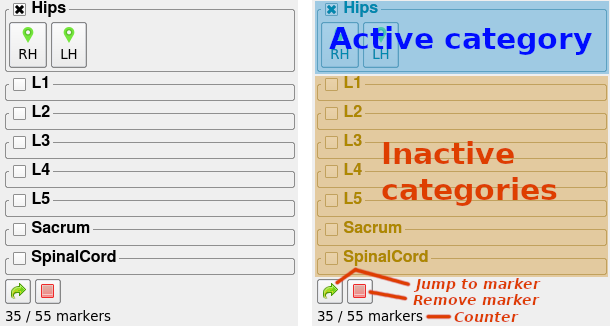
The Landmarks widget allows for predefined landmarks to be placed. In this screenshot the hips category is active. It contains two markers to be placed: RH (right hip) and LH (left hip). The green icon indicates that markers are already placed. A red icon means there is no landmark yet and a yellow color means that that landmark is active for being placed.
Template
Parameter |
Type |
Required |
Description |
|---|---|---|---|
markers |
array |
yes |
An array of marker specifications: an object with
the fields |
groups |
array |
no |
Definition of the marker types and styles. This is an array of objects. |
The structure o the groups parameter is similar to that of the
MarkerEdit.
For example:
{
  "marker_widget": {
    "control": "Landmarks",
    "markers": [
      {
        "category": "Hips",
        "type": 1,
        "name": "RH"
      },
      ...
      {
        "category": "L1",
        "name": "L1SA"
      },
      ...
    ],
    "label": "Markers",
    "groups": [
      {
        "color": [255, 123, 4],
        "line_width": 2,
        "description": "Landmarks on the spine",
        "marker_type": "Dot",
        "marker_size": 3
      },
      {
        "color": [44, 115, 255],
        "line_width": 2,
        "description": "Landmarks on the femural head",
        "marker_type": "Circle",
        "marker_size": 32
      }
    ],
    "y": 0,
    "x": 0
  }
}
As shown, the markers parameter references the type as the index of the
element in the groups parameter.
Resulting data
The resulting data for the template example shown above:
{
  "markers": [
    {
      "id": 1830,
      "type": 1,
      "pos": [-69.01, 46.86, -48.75, 0, 0, 0],
      "name": "RH",
      "vec": [0, 0, 0]
    },
    ...
    {
      "id": 1832,
      "type": 0,
      "pos": [-1.63, 30.07, 165.05, 0, 0, 0],
      "name": "L1SA",
      "vec": [0, 0, 0]
    },
    ...
  ]
}
For each defined marker in markers there is an entry in the resulting data
structure. The pos and vec are the same as in the MarkerEdit.
The type field indicates the type of the marker (used for the display style).
The id field is mostly for keeping track of the markers internally, but
save for consistency.
CSOEdit
The CSOEdit widget allows the user to draw contours to annotate regions of interest in scans. The each contour situated in a plane, but it can be in the orientation of the users choice. Users can add, remove and edit the contours.
Example of a CSOEdit. The buttons are (from left to rigth) for entering edit mode, jumping to the CSO, and to remove the entire CSO.
Template
The CSOEdit template is somewhat similar to the MarkerEdit.
There is a type and groups specification.
Parameter |
Type |
Required |
Description |
|---|---|---|---|
cso_type |
int/string |
no |
The type/class of the cso. A string that references a widget that controls the marker type (defaults to 0). If this is not a string pointing to another widget, a selection box is added to the widget. |
groups |
array |
no |
Definition of the marker types and styles. This is an array of objects. |
group_label |
string |
no |
The name to add to the type selection box in the widget, defaults to “group” (in case one is added) |
For example:
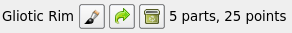
"infarct_segmentation_gliosis": {
  "control": "CSOEdit",
  "type": "CSO",
  "label": "Gliotic Rim",
  "cso_type": "infarct_type",
  "groups": [
    {
      "label": "Cortical infarct",
      "description": "The outline gliotic rim",
      "color": [255, 128, 96]
    },
    {
      "label": "Subcortical infarct",
      "description": "The outline gliotic rim",
      "color": [64, 128, 255]
    },
    ...
  ],
  "x": 0,
  "y": 2
}
This CSOEdit widgets references another widget infarct_type for the
determining the type of the contours.
The group parameter is an array of objects describing a group. This have the following fields:
label, label of the marker (displayed when marker is active)description, a description of the marker typecolor, an array in the form[r, g, b]with ints[0-255]or floats[0.0-1.0]. Alternatively a string with a hex color can be used (e.g.#0000FFfor blue)
Resulting data
The result data of the CSO edit is the list of seed points per CSO, for example:
{
  "csos": [
    {
      "seed_points": [
        [41.749969482421875, 8.565338134765625, 33.242401123046875],
        [42.492218017578125, 12.640533447265625, 33.805572509765625],
        ...
      ]
    },
    {
      "seed_points": [ ... ]
    },
    ...
  ],
  "group": "Other"
}
As shown above, the structure of csos is a list of CSO objects. For these
objects only the seed_points are save. This is an array of the coordinates
of the seed points. The entire contour is constructed by spline interpolation.
CalculatedScore
The CalculatedScore widget calculate a value based on the value of other widgets in the context. The value is updated live and displayed as a simple field:
Example of a CalculatedScore widget, the value is updated live if any of the variables used in the calculation are changed.
Template
The validation control has few additional parameters, you need to specify which other widgets values are to be used in the calculation and specify the formula for the calculation:
Parameter |
Type |
Required |
Description |
|---|---|---|---|
variables |
object |
yes |
Mapping indicating the variables to be used in the condition function. Form is {“variable_name”: widget_name} to map a desired variable name to the value of the given widget. |
formula |
string |
yes |
Single line of Python code specifying the condition, variables defined in the variables parameter are usable. |
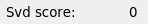
For example one could calculate a compound SVD score based on separate fields. The SVD score gets one point each for:
The presence of lacunar infacts
The presence of lobar microbleeds
The presence of non-lobar microbleeds
The presence of enlarged PVS
A fazekas score of 3
This would like to an entry like:
"svd_score": {
  "control": "CalculatedScore",
  "label": "Total SVD score",
  "variables": {
    "infarcts": "infarct_list",
    "lobar_microbleeds": "lobar_microbleed_present",
    "non_lobar_microbleeds": "non_lobar_microbleed_present",
    "pvs": "moderate_severe_pvs",
    "fazekas": "fazekas_score"
  },
  "formula": "(len([x for x in infarcts if 'Lacunar Infarct' == x['infarct_type']]) > 0) + (lobar_microbleeds or non_lobar_microbleeds) + pvs + (fazekas == 3)",
  "x": 0,
  "y": 11,
  "type": "Integer"
}
Note that in the formula the variable infarcts will have the value of the
infarct_list widget.
ValidationControl
The validation control is a special control that can check certain conditions and prohibit the task from finishing if the conditions are not met. This can be to make sure a value is properly set or mutually exclusive conditions are not accidentally set.
The ValidationControl widget appears as a field on which you can see if the condition is met or not.
Template
The validation control has few additional parameters:
Parameter |
Type |
Required |
Description |
|---|---|---|---|
variables |
object |
yes |
Mapping indicating the variables to be used in the condition function. Form is {“variable_name”: widget_name} to map a desired variable name to the value of the given widget. |
condition |
string |
yes |
Single line of Python code specifying the condition, variables defined in the variables parameter are usable. |
action |
string |
no |
The action to use, the default (and only option currently) is validate. |
args |
object |
no |
argument required for action function, currently not used (validate action does not need it) |
In the example below there is a check if at least one item is in a listing or a specific checkbox stating there is no items (and not both):
{
  "validate_list": {
    "control": "ValidationControl",
    "label": "Infarcts checked",
    "x": 0,
    "y": 10,
    "variables": {
      "listing": "infarct_list",
      "checked": "no_infarcts_checkbox"
    },
    "condition": "(len(listing) == 0 and checked) or (len(listing) > 0 and not checked)"
  }
}
The local variable listing in the condition will have the value of the infarct_list widget. Similarly, the checked variable will have the value of the no_infarcts_checkbox widget.
Note
TODO: There are actions and args which are not yet documented. This is a known TODO point.